Our 5 Favorite Techniques that Bring Graphics to Life
It takes a couple of seconds to realize the difference between poorly designed graphics and graphics that pop and capture your attention. Making sure that your graphics are well designed is vital for all aspects of your business from your branding and display advertising, to marketing. A well designed image can support your message while a badly designed image can actually detract from your message. At an event, your trade show signage needs to capture the attention of passing, often distracted, attendees. Here are some of our favorite techniques to bring your graphics to life.
Tip #1: Don’t Underestimate the Power of Blank Space
One of the biggest mistakes that we see is people overwhelming their graphics. They overdesign it which makes the image look really busy. This makes it hard for a person to focus and figure out what the image is about which often leads to it being ignored. Blank space helps highlight your message as well as the images used in the design. It allows people to quickly ‘get’ what your image is about.
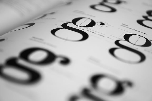
Tip #2: Maximize Typography
If you want your image to speak to your audience, you want to make use of typography. Try to go with a font that has great readability and has character. You want to try to avoid fonts that are used frequently to help you stand out. You also want to vary your copy by using underlines, italics, and various weights to differentiate aspects of your message and highlight important elements. For example, the headline should be bolder and bigger than the following words in the message.
Tip #3: Use Contrasting Colors
Using contrasting colors will help you accentuate your overall presentation when done correctly. Colors can help support your message while also pointing attention to specific parts of your copy. However, there are some general rules to follow. The colors should not clash with the message or general theme. Some businesses may also want to stay within their brand’s colors to maintain familiarity. The idea here is to be compelling with contrast rather than be contradicting.
Tip #4: Optimize Graphics for Various Sizes
Graphics that look fine on smaller layouts may come out as blurry and grainy on larger layouts. To avoid this problem, you want to start out with a high quality image. High quality graphics stay intact even when they are scaled to bigger sizes. You should think twice about using images from the search engines and use high quality stock photos if necessary.
Tip #5: Use Specialists for Your Designs
Most business owners will obviously end up hiring a designer for a project. The problem with this is that they think that any designer can work on any kind of project. For example, billboard ads, catalogs, websites, or even trade show signage all have different subtleties that can make or break the design. If you were planning to set up a trade show booth, a smart idea would be to consult with a specialist as they are expert trade show booth designers. If there is a lot riding on your project, always go with a specialist even if you have to pay a small premium.


